

Cultural Atlas
A cultural knowledge base by SBS
The Cultural Atlas is an educational resource providing comprehensive information on the cultural background of Australia’s migrant populations. Its aim is to improve social cohesion and promote inclusion in an increasingly culturally diverse society.
To accommodate the significant growth and exposure the Cultural Atlas received in the past 6 months, a set of features needed to be implemented focusing on UX and performance.

“It is not our differences that divide us. It is our inability to recognise, accept, & celebrate those differences”
Audre Lorde

My role
UX/UI Design
Timeline
2 months - UX process
Materials
Sketch, Zoom, Whiteboards, Post-it notes
Scope & Constraints
-
A new responsive website with an improved UX/UI
-
New "buy" feature & checkout system for PDF info packs
-
Checkout system must incorporate current payment integration portal


Problem statement
The current Cultural Atlas website, has multiple usability & accessibility issues. Lack of responsive design, slow loading content, & unintuitive design prevent users from taking full advantage of the website.
The company would also like to provide users the ability to purchase lessons plans, but lack of current functionality prevents monitisation of the website.
Project goals
-
Improved, more modern design
-
Introduce mobile and tablet optimisation
-
Design a checkout system for teaching packs
-
Improve accessibility & meet WCAG requirements
-
Reduce bounce rates by 10%
-
Increase user session times by 10%
-
Increase page views by 5%
Design process

Discover
-
User interviews
-
Competitive analysis (SWOT)
-
Data analytics
Define
-
Personas
-
Empathy map
-
Journey map
Ideate
-
User flows
-
Card sorting
-
Information architecture
Design
-
Wireframes
-
High fidelity design
Test
-
Google analytics
-
Hotjar feedback tool implementation
Discover
Competitive Analysis
I reviewed multiple websites & downloaded their teaching kits to see how in-depth their product offering was, and how it compared to the Cultural Atlas. After I completed a SWOT analyses of the websites, I had a good idea of the shortcomings I should avoid & what unique features our product could offer.
National Geographic

Encyclopædia Britannica

User research
Qualitative
10 past website users
-
Calendly, Zoom & Miro
-
10 sessions over 4 days.
-
2 days synth
I reached out to Cultural Atlas newsletter subscribers and asked them if they had 30 mins to participate in some user interviews to help us improve their experience.
I sent them a link Calendly link to setup a time that worked for them, & a Zoom link for the interview.
Towards the end of the interview I sent them a link to a Miro board for a quick Card Sorting to get a better idea of how they would prefer to navigate the website.

User interviews
Sample questions:
-
What is your role
-
What is your main motivation for visiting the Cultural Atlas
-
What websites do you commonly use to find information on cultural & historic topics?
-
When visited the CA last, did you find the information you needed?
-
How would you rate your over all experience using the CA?
-
Are you subscribed to other similar websites?
-
Have you bought an info/teaching kit about before? And if, not what would motivate you too?
💡 Key insights
⭐️ Our users were split up into 3 main categories
-
students (high school & university)
-
high school teachers
-
university lecturers
⭐️ All users found the onboarding / intro into the website long & unnecessary, and wanted the ability to skip it earlier.
⭐️ 9 of the 10 users found the information on the Cultural Atlas very helpful.
⭐️ All 6 teachers/university lecturers, and 1 student, had bought teaching kits before.
⭐️ Most students didn't want to pay for information kits. They felt that even if it had good information they could probably find it online somewhere else for free.
"I need a bunch of sources for my assignment, so paying for one won't be enough to complete an assignment. Maybe if I definitely could use it for my assignment."
- University student
"I love the Cultural Atlas! I teach grade 10 social studies so having a free resource that I can use to help build my lessons if awesome. And I know the SBS is reputable so I'm not worried that the info may be wrong."
- Highschool teacher
Quantitative
Data analytics
📈 Google Analytics
I used Google Analytics to review;
-
How users were finding & accessing the Cultural Access
-
How many of them were leaving straight away
-
How long users were spending on main culture pages
-
Behavioural flow of users
-
What pages they were accessing the most
💡 Key insights
Bounce Rate
62%
Main drop-off point
Onboarding screen
Avg. session duration
120 mins
Most popular pgs
Glossary
Cultures search pg
Define
Personas
With the data collected from the interviews, I created 3 personas representing our key users. The personas helped our team arrive at better solutions as it gave an in-depth understanding of the user goals and frustrations, and overall personality. Here are some examples of their goals & frustrations.
.png)
.png)
Empathy maps
This process was done to define the target audience with more clarity, as well as illustrate their needs and pains. Empathy mapping helped us gain perspective on the users thoughts and feelings.
The data in the empathy maps was based on the insights from user interviews.

Journey Mapping
Based on the user interviews, & behaviour flows in Google Analytics, I could make clear AS-IS users journeys to understand where the key pain-points were in the user experience.
This allowed us to plan out the future user flows to avoid these issues.

How Might We Questions
Based on the insights I gathered, I developed trigger questions incorporating the main needs and opportunities. These would be used to focus any
features or solutions, to make sure they always tied users and business needs.
HMW help users find cultures & information faster.
HMW let the users save information easier.
HMW do we make
the culture pgs easier to read.
How might we get users to come back to the website
Ideate
Userflows
Before moving into the design phase, I built our user flows mimicking how our users would move throughout the site. These user flows helped to
identify key screens and decision points that users would face.
Information Architecture
Using the feedback I received from the card sorting exercise we did during the user interviews, I was able to rework the lay out of the website clearer. By
adding additional tabs to the main navigation for
sections such at Training, and Feedback, we will be able to highlight these features to users, which have previously been hidden within other pages.

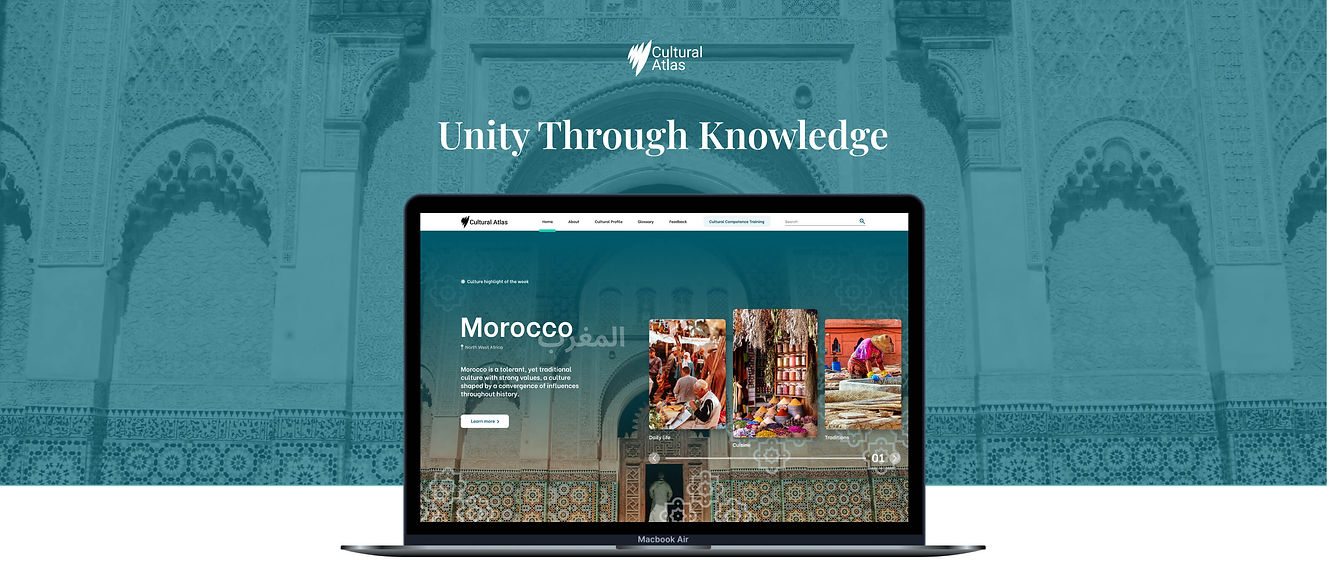
Design
Final designs
Based on our user testing sessions & analytics review, it was an easy decision to remove the onboarding screens and create a dedicated space for the projects history and purpose in the About page.
.png)
I put an increased emphasis on imagery & visuals to help build excitement and enhance the viewing experience. This allowed for a more vibrant design, while still leaving enough space for important content.
.png)
From the user interviews & reviewing Zen Desk tickets we discovered that users, especially teachers, wanted the option of downloading the content. While I was restricted to the method of payments IES would accept (credit/debit card only),
the new easy checkout modal allowed users to purchase a PDF version of any culture they were on, & integrated with our existing 3rd party payment portal.
Test
Analytics
-
Reduced bounce rates by 34% thanks to fast loading speed and simplification of on boarding
-
Increased user session times by 18% through easy to navigate content
-
Increased page views by 15% through better navigation and better internal linking structure
-
Within the first 8 weeks of the new launch the website made $2310 in revenue (teaching kits were sold at $5)
The redesign of the Cultural Atlas has drastically improved the bounce rate and user engagement on the website. Our goal was to make it easy for curious readers to learn about different cultures, and we've reached our goal.

Results

